Music
In the music industry, pink (usually paired with black) is often used to feel edgy and fun.
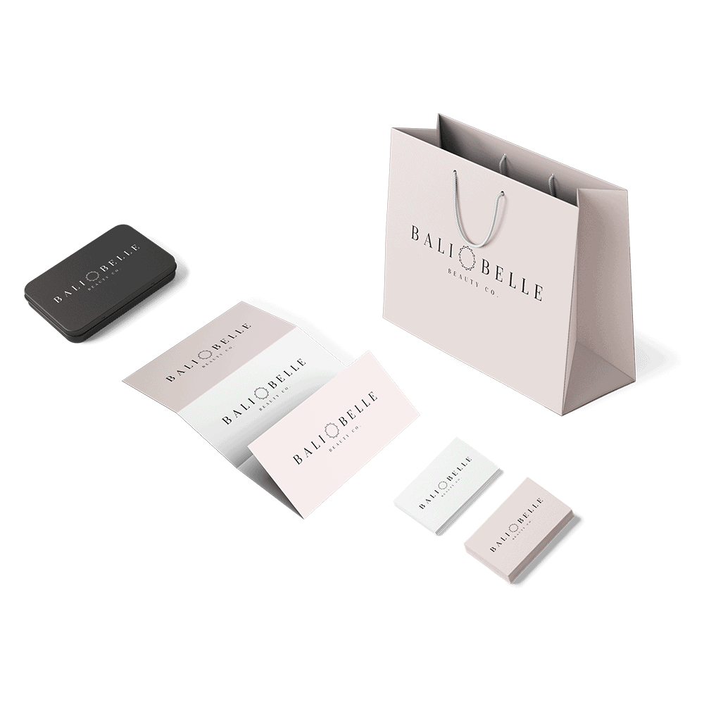
Do you need a soft, playful, or feminine logo for your business? Pink logos can be attractive and unique in a variety of industries. Check out our collection of pink logo design inspiration below.
Pink is generally thought to mean:
Bright pinks often feel fun, playful, and energetic. But if you want your pink logo to feel more tender, feminine, or romantic, a lighter shade might be a better fit.
In large quantities, bright pink has the potential to be overbearing or hard on the eyes. So if you want to use pink as your primary color, soft pink is usually best. But a vibrant hot pink can be stunning as a secondary color, especially paired with a neutral.
The colors you pair can dramatically change the look and feel of your pink logo design. For example, pink and purple can feel soft and calming, but pink and black can feel more high energy or edgy.
In the music industry, pink (usually paired with black) is often used to feel edgy and fun.
Because pink is often associated with femininity, the fashion industry sometimes uses it to target a young, female demographic.
In a personal logo, pink can be used to communicate individualism and creativity.