Photographer
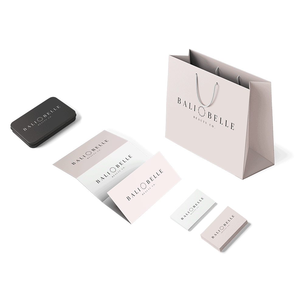
In photography, a nice neutral light gray can help the colors in your photos stand out.
A gray logo can be cool, neutral, and timeless. See our collection of gray logo design inspiration and explore how other brands use gray in their logos. Then start creating your own!
Businesses often use gray in logos to convey:
On its own, gray can feel formal, elegant, or modern. But since it is a neutral color, it’s often used as a companion to others. Gray can soften an otherwise edgy palette, or add strength and mystery to a brighter palette.
Consider using gray in your palette if you want to break up a lot of white without adding in a brighter, more dominating color.
Any color can be paired with gray if has the right contrast. For example, a dark gray can look great paired with a light blue or green, but a lighter shade can help tone down bright colors. Consider the tone of your gray as well: A cool gray could pair well with blue, whereas a warm gray might look better with red.
In photography, a nice neutral light gray can help the colors in your photos stand out.
Certain shades of gray resemble silver and look sleek paired with black. Black and silver are the most common colors in the auto industry.
Gray logos can appear mature and sophisticated, and add a professional feel where trust and credibility are key.