Minimalism and simplicity are big trends that have swept logo design in nearly every industry in recent years. From interior design to fashion and everywhere in between, minimalistic design is front and center.
This trend has even swept the snack food industry, with brands like Madegood and Smart Sweets keeping their designs simple, with clean lines and relatively neutral colors.
When snack logo designs aren’t minimalist, it’s still nearly just as common to see fun fonts, bright colors, and eye-catching designs, such as those seen on brands such as Chewy Bars and Kind Bars.
These on-trend snack logos look great on store shelves, helping retailers to create appealing displays that catch the eye of the consumer and clearly indicate what they’re buying into. Just as it’s important to have a logo and package design that stands out, it’s important for logos to suit the brand’s identity and the food inside the packaging.
Here are 10 of the most appealing snack logos that look great on shelves.
1. Kind Bars
Multiple colors and a simple font indicate the natural goodness that one can expect when biting into a Kind Bar. The rectangular shape of this brand logo also makes it easy for merchandisers to create beautiful in-store displays that feature clean, stark lines that easily catch customers’ eyes.
![]()
2. Goldfish
Goldfish are a great snack for kids and the simple but fun logo that Pepperidge Farms has chosen for Goldfish packaging indicates this. The incorporation of the word baked inside the circular logo helps parents feel good about choosing Goldfish for their children and the big, smiling fish on the cover appeals to a younger audience.
![]()
3. Madegood
Madegood creates school-safe, allergy-safe organic snacks that are great for kids and adults. The logo is simple, with the brand name written out in a plain, legible font and the o’s in the word “good” joined together. The logo’s earthy color palette, combined with the name, indicates that the ingredients are simple and the brand is a good choice for those seeking healthier alternatives.
![]()
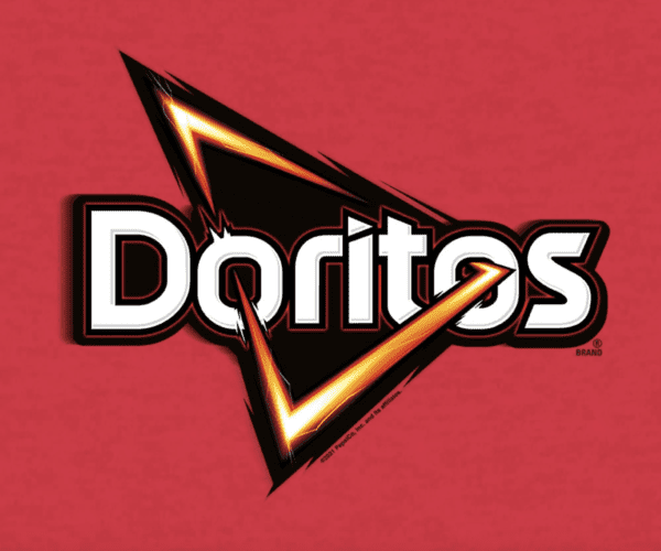
4. Doritos
Capturing the edgy feel of the Doritos brand was key to its most recent logo design. The firey triangle, representative of their famous chips, delivers a sense of ferocity and boldness that brave snackers must have when munching on a Doritos chip. With their many spicy and unique flavor offerings, this chip logo calls attention right away on a shelf.
5. Smart Sweets
With a snack logo that’s clear and easy to read, Smart Sweets’ logo is clearly indicative of the brand’s goal, which is to appeal to snackers as a healthier alternative to traditional candy and sweets.
![]()
6. Smartfood
Smartfood makes pre-popped popcorn that’s touted as a good alternative to other salty snacks. Its logo, which features the brand name written on an angle in a playful yet modern font, indicates the simplicity of the snack’s ingredients.
![]()
7. Clif Bar
Clif bars are high-protein snack bars made to accommodate people with active lifestyles. The logo, which is intentionally vertically aligned stands out distinctly on each bar. Play around with your snack logos orientation and see what fits your product best!
![]()
8. Chewy Bar
Chewy Bars are a timeless snack that have appealed to kids for decades. These granola bars are adorned with a bright yellow logo and juvenile block letters that stand out to kids.
![]()
9. Welch’s
Welch’s products feature a bold, classic logo. The brand name is displayed on a ribbon-style banner. This retro-style logo has been with the brand since its early days and nods to its history and longevity in the U.S. market.
![]()
10. Yomms Nuts
Simple block letters on a rusty-orange background make it easy to see Yomms Nuts brand anytime they’re displayed on a store shelf. Bold colors and bright packaging appeal to consumers and the minimalistic design indicates simple ingredients.
![]()
Logo Design Inspiration
Whether you’re branding snack foods or searching for logo design inspiration for something else, the snack food logos mentioned above can help draw inspiration and give a good idea of what logo styles and types look good to consumers.
Whether you’re looking for something simple for a brand with a relatively short name or new design ideas for a brand with a longer name, check out the options available from My Free Logo Maker.