Rarely does a creative project start without inspiration, and a logo is no different.
Whether you’re a professional designer or an inexperienced-but-determined DIYer, seeing logo examples from a range of industries — and with a bunch of different layouts, color schemes, fonts, and symbols — will help you better determine what you want for your own design. You gotta start somewhere, right?
That’s what this list of logo examples is for. Some are text logos with bright pops of color or super-bold fonts; others are simple combination logos with symbols that hint at the businesses they represent. All of them were made on My Free Logo Maker!
Browse through the examples and note which ones you like best (and which ones you really don’t like). Then go forth and design a logo for your new business!
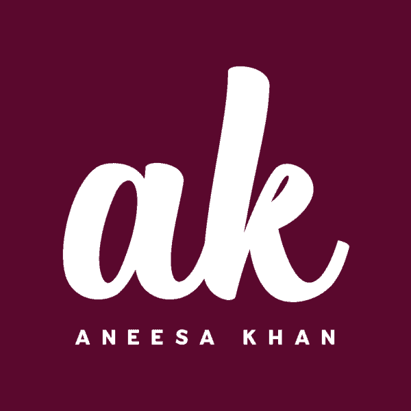
Classy initials: An initial logo is a great choice for a personal brand — it’s simple and timeless. The handwritten font makes it feel personal, while the contrast between a lowercase monogram and uppercase slogan adds visual interest. Note how the length of the slogan spans the exact width of the “ak” for balance and symmetry.
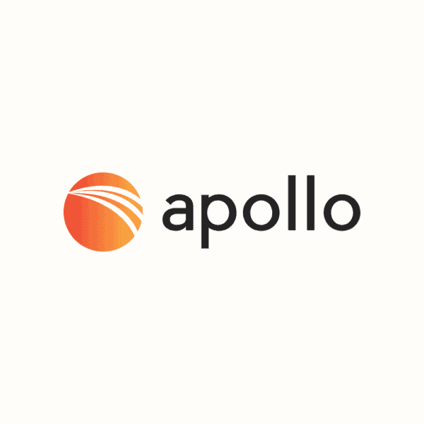
Pop of gradient: The abstract symbol in this logo is punched up with a subtle orange gradient that doesn’t scream “trendy.” The rest of the design is simple — black sans-serif font, neutral background color — to keep things balanced and professional.
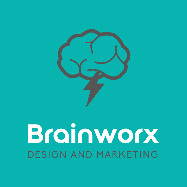
Literal symbol: Sometimes symbols can be abstract (as seen in the Apollo logo) and sometimes they can be more literal — in this case, a flash of lightning coming out of a brain to match the name “Brainworx.” Both are good choices — it really depends what you’re looking for, and how literal you want to go!
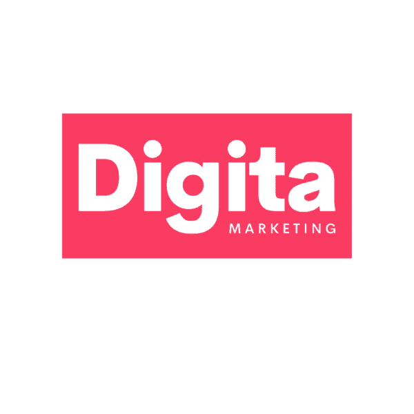
Wordmark-in-a-box: If you have a short company name (under 10 characters), you can try putting it in a box to add some visual oomph. The hot pink used in this logo example, paired with a blocky font and a short, right-aligned slogan, makes for a super punchy design.
Related: How to add or edit a logo slogan in My Free Logo Maker
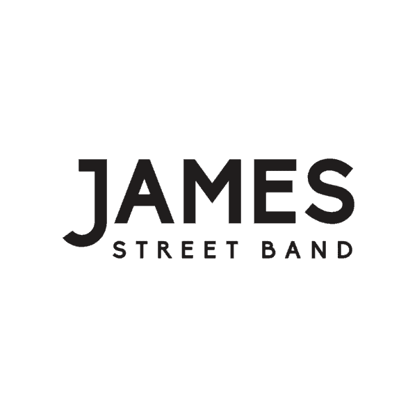
Drop letter: This black-and-white logo with a classic sans-serif font is easy on the eyes. The dropped “J” makes it memorable, and the perfectly aligned slogan (spanning the A to S in “JAMES”) makes it a compact and scalable design.
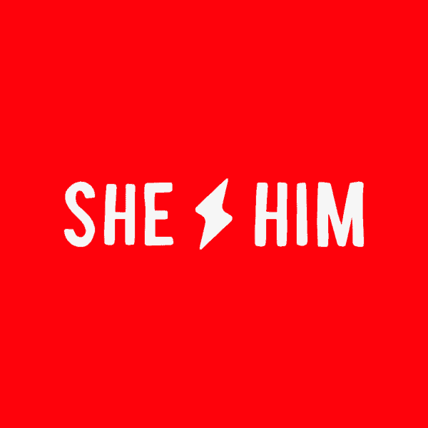
Symbol as divider: If your company name has two words (preferably around the same length), why not try a symbol as a divider? This logo takes a bold color, a slightly quirky font, and a simple symbol, and puts them together for a memorable band logo.
Symbol divider, part II: Here’s an example of how a symbol-as-divider layout can work with a slogan and a more complex “hand drawn” symbol. This logo also uses the same font in the company name and the slogan, to help unify the design.

Personal meets professional: This minimalist logo communicates so much with a simple symbol, a clean font, and a one-word slogan. Keeping the design to two colors ensures this logo is easy to use on different backgrounds and on top of images and videos.
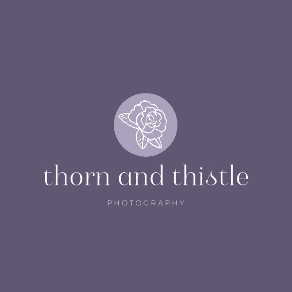
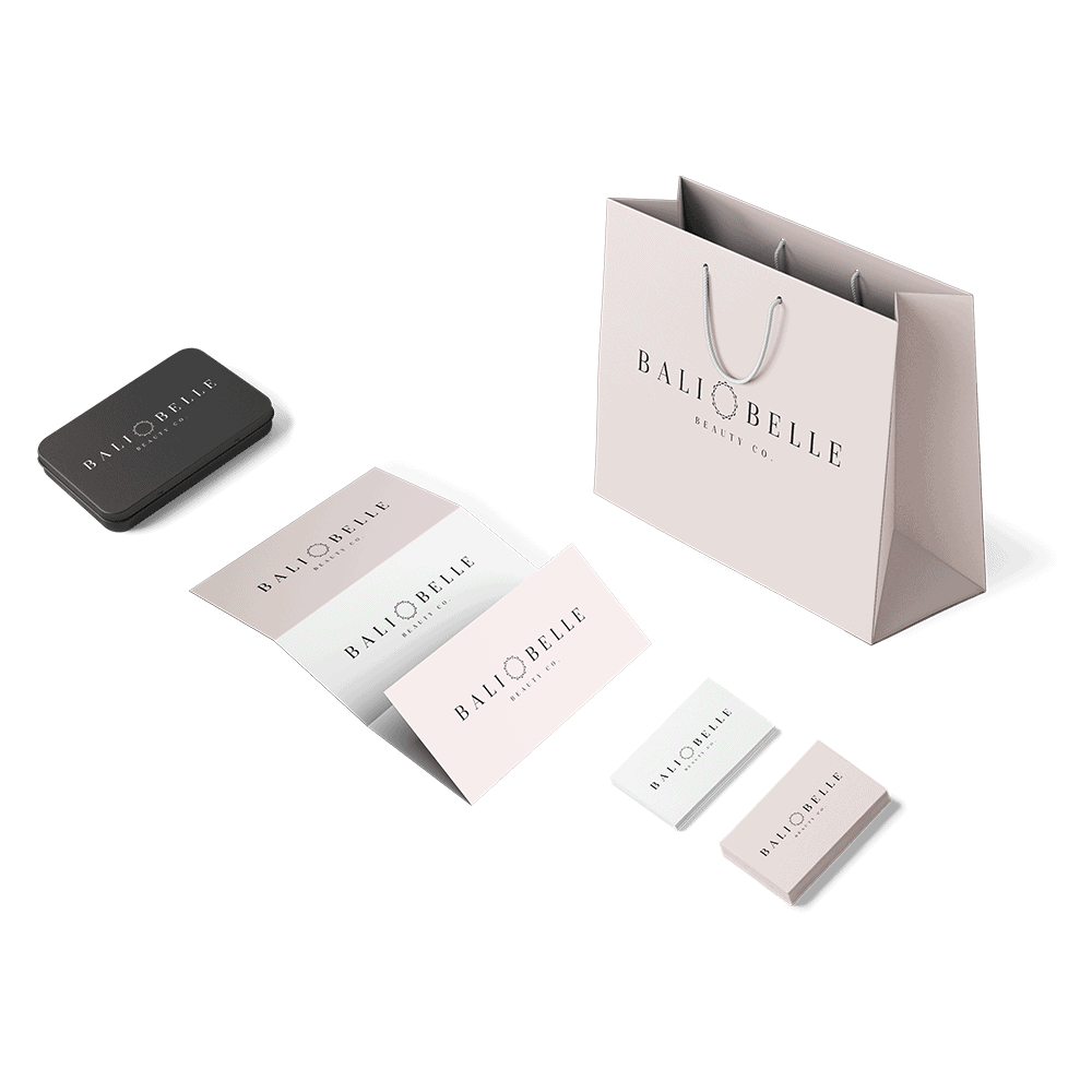
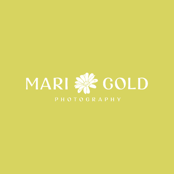
Shades of purple: This logo’s dusty purple color palette conveys a high-end, boutique vibe. The circle around the flower symbol adds another layer of dimension to the design, as does the mix of serif and sans-serif fonts in the company name and slogan.

Textured text: A font can communicate so much! The paint-stroke quality of this “paint stroke” text feels gritty — which is exactly what you’d want a true crime podcast to feel like. A black-and-cream color palette is a subtle twist on classic black and white.
Related: How to explore fonts in My Free Logo Maker
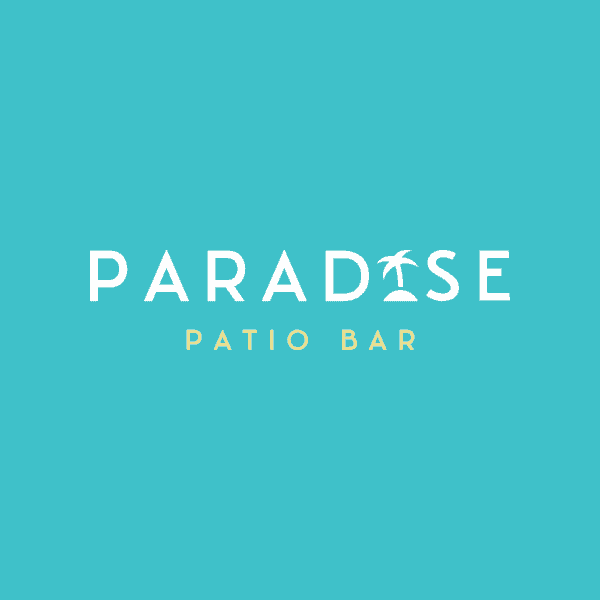
Letter swap: Who doesn’t love a good letter replacement ? In this logo example, a palm tree symbol stands in for the “I”, evoking major tropical vibes. The slogan pops out in a sunny yellow, the perfect addition to the beachy color palette.
Related: How to add/edit a logo symbol in My Free Logo Maker
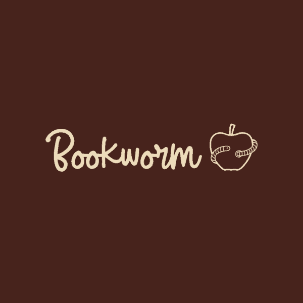
Handwritten charm: Remember learning cursive? With handwritten text, an earthy color palette, and an apple symbol, this logo evokes the nostalgia and practicality of school. It’s friendly without being too playful, and the wordmark looks good on its own or beside the symbol.
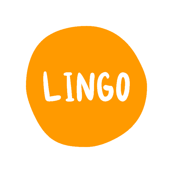
Bright spot: This logo is inviting for a number of reasons: the vibrant orange color, the slightly imperfect circle, and the quirky font. If you have a shorter company name, experimenting with shapes like circles and rectangles can add lots of personality to your logo design.
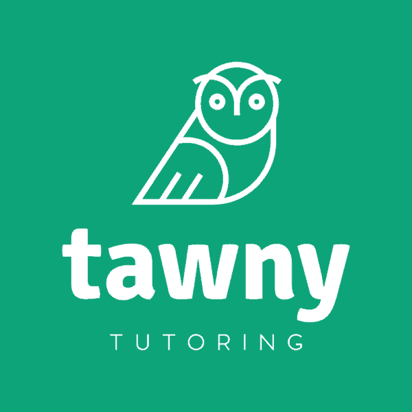
Animal mascot: Looking for a mascot to help brand your new business? Choose an animal symbol that you can use in other parts of your marketing — like this owl, which is the perfect choice for a tutoring company.
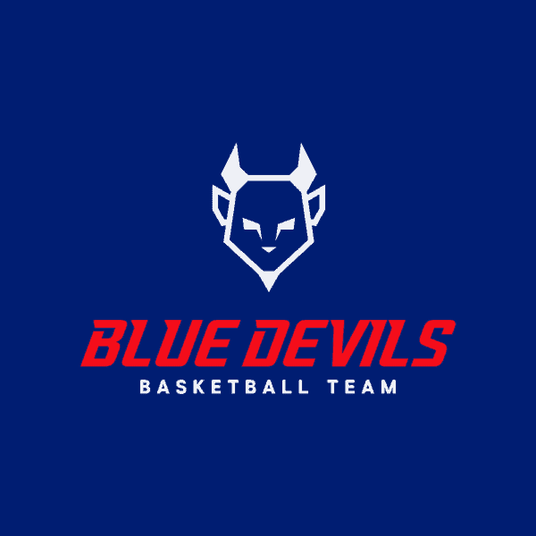
Tri-color action: This logo has the bold elements it needs to stand out on a basketball court, including three high-contrast colors that work beautifully together. Combined with all-caps text and a memorable symbol, this logo is what dream teams are made of.
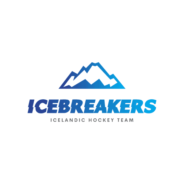
Font movement: Want to make an action-packed logo? Look for a font that has an element of movement — in this case, some blurred lines and vibration. Mixed with a blue gradient and strong mountain symbol, this logo communicates the energy of a good hockey game.

Symbol symmetry: With stacked text and an outline symbol, this logo achieves symmetry and compact-ness by aligning the bottom of the symbol with the bottom of the company name. This layout also makes the symbol easy to view, even at small sizes.
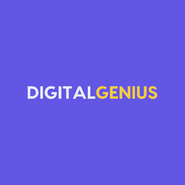
Color block: Is your company name two words — or two words in one? Try making the words different colors to add visual interest and make your name easier to read. This white/yellow/purple color combo is cheery and puts the emphasis on “genius.”
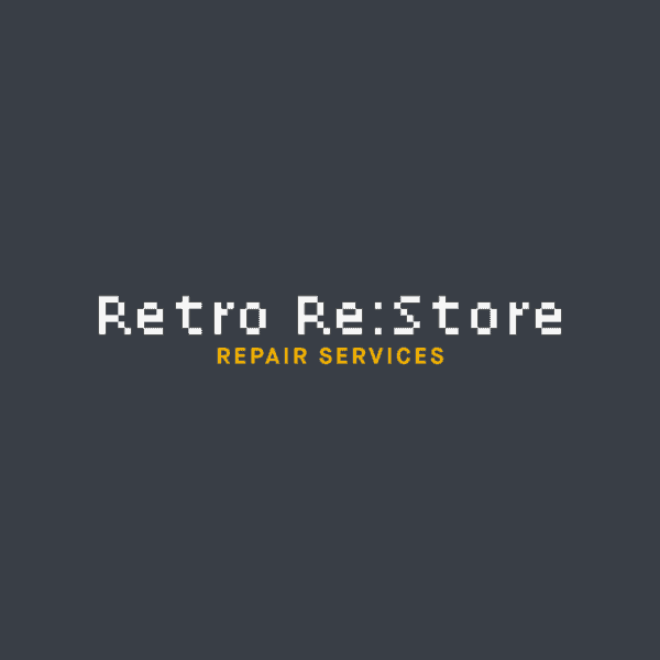
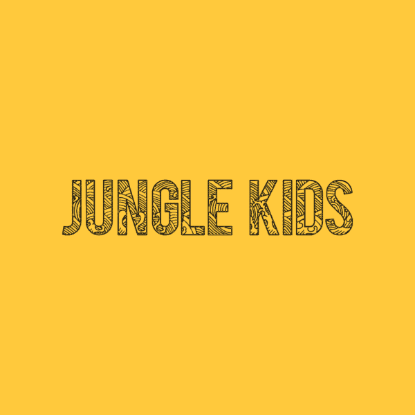
Pixelated panache: While a super distinctive font isn’t right for every business, it can add a ton of personality to your logo. In this case — an electronic repair shop — the pixelated font ties in to the “retro” of the name and signals at the services the company offers.
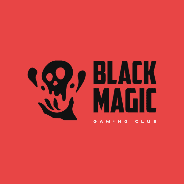
Standout symbol: A symbol can say so much about your business, side project, team, or club. Symbols can range from cute to retro to scary (as seen above), so make sure to find one that speaks to your target audience. (p.s. My Free Logo Maker has thousands of symbols to choose from!)
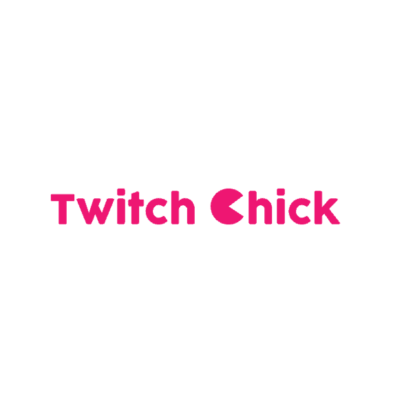
Character switch: It’s easy to punch up a simple wordmark logo with a juicy color (pink!), a clever symbol-as-letter placement (in this case, a Pacman-like C), and a clean font. Keep a white background for the ultimate versatility, especially if you’ll be using your logo mostly online.
Greyscaled: A logo without bright colors doesn’t have to be boring. This classic logo uses a white textured font, an almost-black background, and a gradient grey symbol to achieve a moody and intriguing design.
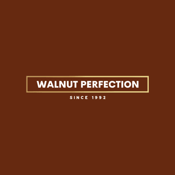
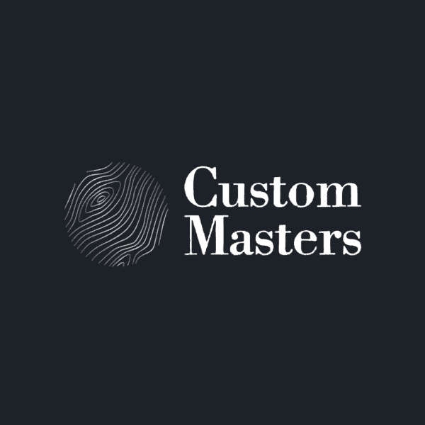
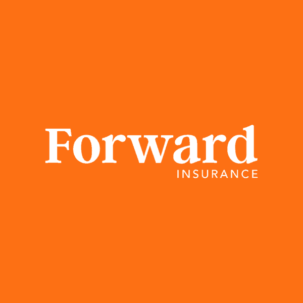
Stamp-worthy: If your logo is going on retail products in the form of labels, stickers, or price tags, you may want to consider a shape for your logo that makes it stamp-like. This simple text logo would look as great on a sign as it would as it would an engraving in a custom wood chair.
Font wild: If your business needs to communicate fun, look no further than an over-the-top font (in the best way possible) and an energetic color. By scaling back other design elements in this logo, the font can really shine, and take on the color of the background it sits on.
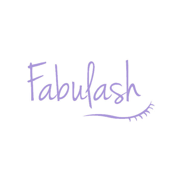
Extra flourish: You don’t often see logo layouts where the symbol is below the company name — but if you have a symbol that could work as an underline, this could make for an awesome design! In this example, a set of eyelashes perfectly complements the handwritten font of the company name.
Staggered text: Want to try spicing up a text logo? If your company name is two words of equal-ish length, you can try stacking the text and moving the bottom line over (this trick also works well if you have a dropped letter, like the “J” in the above James Street Band logo). So simple, so classy!

Layered effect: Here’s another cool stacked text trick — instead of keeping the words separate and on top of each other, the overlapped text (with contrasting fonts and colors for readability) makes for a super cool and original logo design.
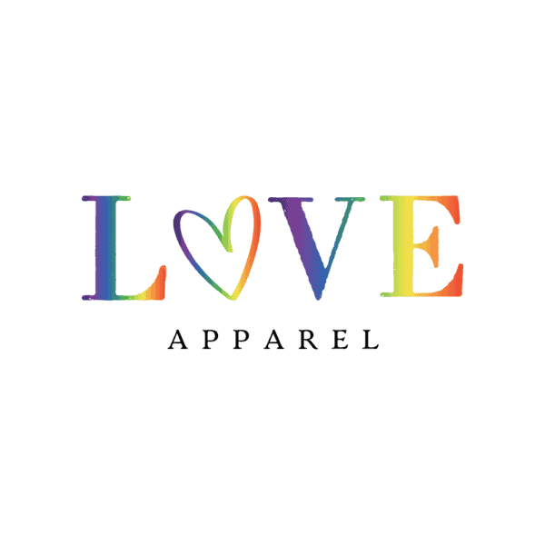
Rainbow bright: A multi-color logo is a bold approach — but when done cleverly, won’t look excessive. By using a gradient in the main font, this logo gets a dose of rainbow magic, but doesn’t look overcomplicated because everything else is kept simple, including the white background. The heart-as-an-O is another nice touch.
Related: How to edit logo colors in My Free Logo Maker
Texture appeal: A large patterned symbol plus textured font adds tons of visual interest to this logo, while a neutral color palette and symbol-on-top layout keeps the design simple and classic. Even though the symbol and text have added detail, the logo still looks good at a small size — key if you’re choosing more complex design elements.
Double lines: Here’s another stacked-text logo where the font takes the spotlight. This outline font is fun and distinctive — when blown up to a larger size and put on a high-contrast background, it stays easy to read. A perfectly spaced-out slogan adds visual balance.

Symbol in motion: If you’re a business that emphasizes speed or movement — trucking, delivery, or fitness, for example — try searching for a symbol that depicts motion. In this case, a van communicates fast and efficient food delivery service.

Purple punch: A cool symbol is made even cooler with a bright blue-and-purple gradient. By making the company name a higher-contrast white, your eyes are drawn there first. Visual hierarchy for the win!
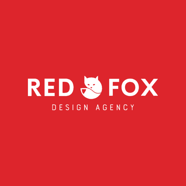
Fox break: With a cute fox symbol nestled perfectly between the words “Red” and “Fox,” this logo shows the power of well-balanced design. The font, symbol, slogan, and color scheme all add to the visual hierarchy and adaptability of the logo.

Enclosed symbol: Circles are a popular logo shape, but if your full logo doesn’t fit in a circle, consider a symbol that’s contained in a circle. In this logo, the lines in the symbol match the weight of the font.

Flight path: You don’t see right-aligned symbols as often as left-aligned ones, but look at this logo example: because the plane symbol is tilted right, it makes sense to have this as a right-aligned symbol, so it doesn’t run into the text. The slogan is also (appropriately) set to the right.

Color block, part II: Spruce up a wordmark logo by giving it a two-color treatment — this turquoise-and-yellow combo is particularly pleasing. If you go this route, a white background is a smart idea, to avoid color contrast and readability issues.
Right side: Your slogan doesn’t have to be perfectly centered under your company name. If it’s short (ideally one word), you can try right-aligning it, as seen here. Tip: Try to align it to the outer edge of a letter to keep things symmetrical.
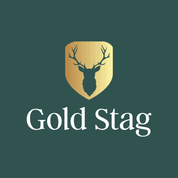
Metallic touch: If you want to add a touch of luxe to your logo, try using gold as an accent color. Metallics look especially good paired with dark colors, like black or forest green. If you opt for a metallic or gradient, remember to keep the rest of your logo simple — gold is a statement color, after all!
O switch: Quick tip: O’s are one of the easiest letters to turn into a symbol. If you have an O in your logo, try experimenting with different symbols, or even adding a symbol inside the letter. It’s an easy way to make a logo more interesting while keeping a clean font and layout.
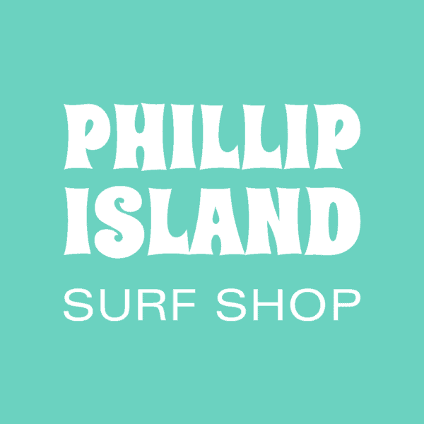
Color vibes: Be sure to use a color that matches the mood or style of your business! In this logo example, a tropical aqua color is the perfect fit for a surf shop logo (as is the fun, retro-style font that doesn’t take itself too seriously).
B+W FTW: Black and white is a classic color choice — in this logo, the color scheme is used to full advantage with a black background, filled white container, and black text. It’s sleek, chic and memorable!
Related: How to edit logo layouts and shapes in My Free Logo Maker
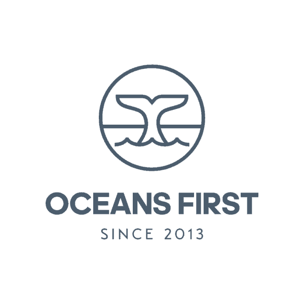
Splashy symbol: Here’s another example of a symbol contained in a circle. The whale tale coming out of the waves is a simple image, but one that perfectly matches the name “Oceans First” — and it’s also reminiscent of a ship window, evoking even more nautical vibes.
Paint splatter: With a bold pink color, and “painted edge” container and font, this logo is perfectly graffiti-esque. Experimenting with different texture effects is a surefire way to make your logo stand out, especially if you’re in a line of business that’s more creative.
Green on green: Who says text logos have to be boring? With two contrasting shades of green, and two contrasting (and overlapping) fonts, this logo is a prime example of a fun-meets-practical design that would look great on a wide range of applications.

Vertical divide: While it’s not always necessary, having a vertical line that separates your company name and symbol can make your design look more polished and professional. In this example, the divider does a great job of separating the block of text (company name + slogan) with the yellow symbol.

Symbol power: This logo checks all the right boxes: it’s simple, distinctive, and easy to remember, in large part because the “O” is has been replaced with a globe symbol that fits right in with the font and color choices. Beauty!
Love any of the logo examples in the above list? They were all made in My Free Logo Maker!
To start designing yourself, generate some logos, then use the editor to customize your design — find all the editing tips you need in our Help Center (or feel free to email us from there if you need a hand).