Fitting a long company name into a logo is kind of like fitting a bunch of toys into a small box — it can be a challenge, and if you’re not careful, you can overload the box and risk clutter and confusion.
But having a long name doesn’t mean you’re doomed to have a bad logo. You just have to be aware that it can make your design more challenging, because long company names take up more space — and therefore leave less room for elements like symbols, shapes, and slogans.
Another thing to be aware of: logos with long company names are harder to scale because more characters are competing for attention. This means a logo can be difficult to read when it appears at a small size, like on a website or in a social profile.
To avoid mistakes and ensure your design serves you well, here are a few things to keep in mind when designing a long company name logo.
Text arrangement
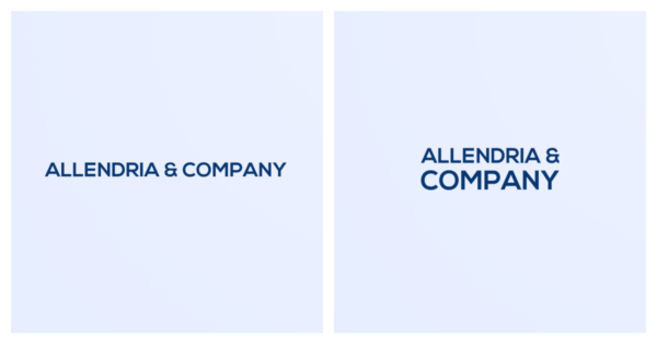
The main thing you want to figure out with a long company name is if you’re going to present the text horizontally or stack it.
While a horizontal text layout is the simplest, it can make the text small and tricky to read. If you’re set on this layout, opt for an easy-to-read font that scales well and make sure your company name doesn’t come too close to the edge of your logo.
Stacked text is another option — it works well for longer names because it makes your logo design more compact than if you present the name horizontally.
In either case, you can still add a symbol or slogan without making the design too busy, though you should do so with caution (more on that below!).
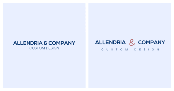
Slogan vs. no slogan
Maybe you have a long company name and a slogan — or sometimes a slogan can do the work of capturing a part of your company name (e.g. if your company name is Petals Wedding Photography, the “wedding photography” part can fit into a slogan).
If your slogan is more of a tagline than a descriptor — e.g. Photos for Your Special Day versus Wedding Photography), ask yourself if it’s *actually* necessary. A tagline can weigh down a long company name (or any company name, for that matter). Remember: More words = more visual clutter!
If your company name does include a slogan, play around with the size, spacing, and alignment to ensure your design looks balanced. Keeping it simple is the best bet if you have a long company name and a slogan.
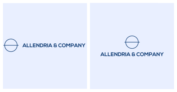
Symbol vs. no symbol
Want to include a symbol in your logo? If your text is on one line, adding a symbol to the left or right of it can take up even more horizontal space and push it to the edge. Try placing the symbol on top of your wordmark to make your logo more compact and see how it looks.
Using stacked text? You’ll probably want your symbol to the left of your wordmark to balance out space.
If you choose not to include a symbol in your logo but want to add more visual interest, you can play around with different text effects — for example, bolding one word or giving your slogan a different font style. (Tip: Explore the Layout tab in My Free Logo Maker for more options.)
What to avoid with a long company name logo
There are some logo design elements you want to steer clear of when you have a long company name. These include:
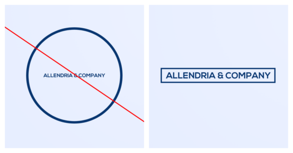
Circle container
If you want to add a shape or underline, you’ll need to proceed with caution, as adding this type of design element can make your logo even busier and more difficult to scale. Always check your text size if you add a container, and be scrupulous in removing other design elements (slogan or symbol) if you’re set on using a container.
The one shape you’ll want to avoid with a long company name is a circle. Because it limits the amount of horizontal space you have in a logo, using long horizontal text in a round shape is a surefire way to make your text too small (see example on left!). A rectangle or underline is a safer bet, as you’ll still get the benefit of horizontal space.
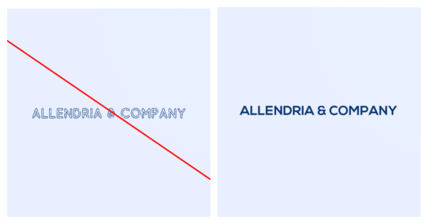
Complex fonts
Complex or detailed fonts are tough to pull off in most logos, but this is especially true for logos with long company names. With more letters in the mix, you want to keep things as clear as possible.
Curved text
One logo arrangement you may be tempted to try if you have a long company name is curved text. But if your name is more than 12 characters, it’s best to avoid this layout — you’ll likely run into readability issues and the design will be harder to adapt for different mediums. There are some exceptions, of course, but it’s usually best to stick with a horizontal or stacked text layout for simplicity and versatility.
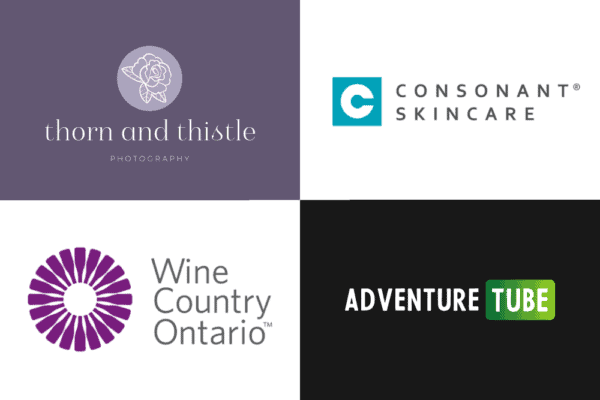
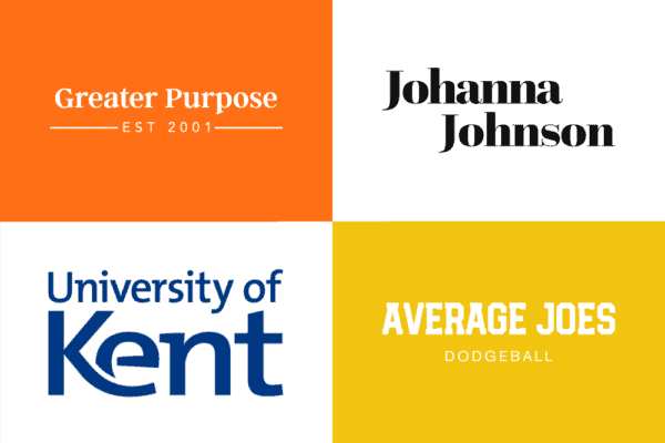
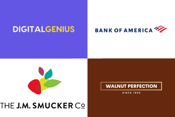
More logo designs with long company names
Need more ideas? Here are more logo examples from companies with long names — check out the mix of horizontal and stacked text, and symbol vs. no symbol to get ideas for your design. When you’re ready, try our 100% free logo maker to see tons of layouts and variations (you can also visit our Help Center for editing tips).