When you’re designing a logo for your business, you’re probably focusing on fonts, symbols, colors (a.k.a. the exciting stuff). But what about your layout?
A logo’s layout is more of an “in-the-background” part of your design, but that doesn’t mean you should underestimate it.
Think about if the Ikea logo didn’t include a yellow oval, or if Nike’s famed swoosh was positioned above the company name instead of below in the original design. The way you arrange a logo’s design elements plays a huge role in how good it looks and how it will appear at different sizes.
When deciding between logo layouts, there are a few factors to keep in mind:
- The length of your company name: If your company name is short, you’re in luck — you have more logo layout types to choose from! If your name is longer or has multiple words, you may be more limited in the layouts that look good. Why? Because it’s harder to keep long text on one line or contain it within a shape while keeping a design scalable.
- If your design has a symbol (or monogram): Including a symbol in your logo design brings more logo layout options into play because of where the symbol will be positioned — to the left of your company name? On top? If you have a text-only (wordmark) logo, your layout options will be different for obvious reasons.
- If your design has a slogan: A slogan is great because it tells people what you do. But it also runs the risk of crowding a logo design, especially if it’s on the longer side. If you want to include a slogan, consider your layout more carefully and how it will fit with your other design elements.
For simplicity’s sake, let’s focus on the two most common types of logos — combination logos (symbol + text) and wordmark logos (text only) and the layouts to consider for each.
1. Logo symbol to the left of text
A left-aligned symbol is one of the most common logo layouts (and logo templates) you’ll see, in part because it follows the Western-world tradition of reading left to right. It’s clean, simple, and works well whether you have a slogan or not.
In this layout, the size of your symbol matters — it should (roughly) match the height and weight of your font, with enough room around it to breathe.
![]()
Proceed with caution if…
Your company name is on the longer side. A left-aligned symbol runs the risk of making your logo too long horizontally, which can make it tricky to fit into smaller spaces (e.g. a social profile). A solution to this is stacking the text and keeping it left-aligned, as seen in the above examples, or moving the symbol on top of the text to free up space.
2. Logo symbol on top of text
Putting a symbol above a company name is another popular layout choice. The stacked arrangement makes for a more compact design and lets the symbol shine because it’s on a different line than the company name. This type of logo also lends itself well to stacked text and slogans.
If your company name is super short, it might make sense to keep the text the same width (or almost the same width) as your symbol. But there are plenty of cases where the company name spans wider than the symbol, as seen below — and that works, too!
Proceed with caution if…
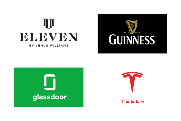
Your symbol is tall. As seen in the above examples, this layout works well with symbols that span horizontally or are relatively even in width and height. The Tesla and Glassdoor logos are an exception to this, and it works because the symbols are simple and easy to view at smaller sizes.
3. Logo symbol to the right of text
This logo layout is not as common as the first two shown, in part because it strays away from the conventions of a left-aligned symbol and puts more prominence on the text. This design is worth testing if you want to try something different — but beware that it could look unbalanced or less “natural” than other arrangements.
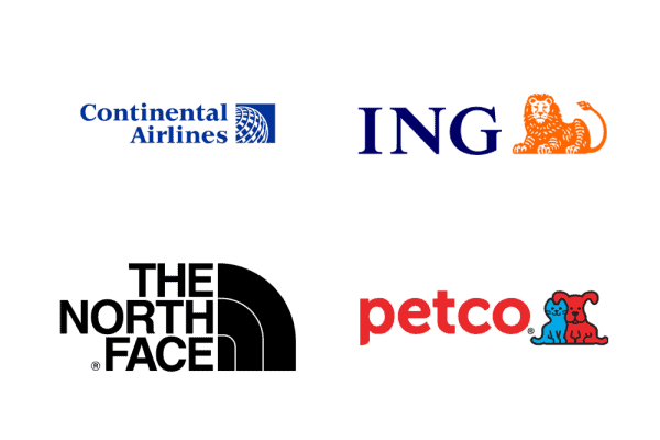
With a right-aligned symbol, it’s best to right-align text if you’re stacking it on multiple lines or including a slogan, as seen in the Continental Airlines and The North Face examples.
Proceed with caution if…
Your company name is long or your symbol is tall. In either of these cases, you’ll want to make sure you’re fitting the symbol and text into your logo design in a way that doesn’t look busy or disproportionate.
4. Logo symbol below text
Placing a symbol below your text can look awkward depending on the symbol shape and size. For that reason, this isn’t a common logo layout, but it still might be one you want to consider.
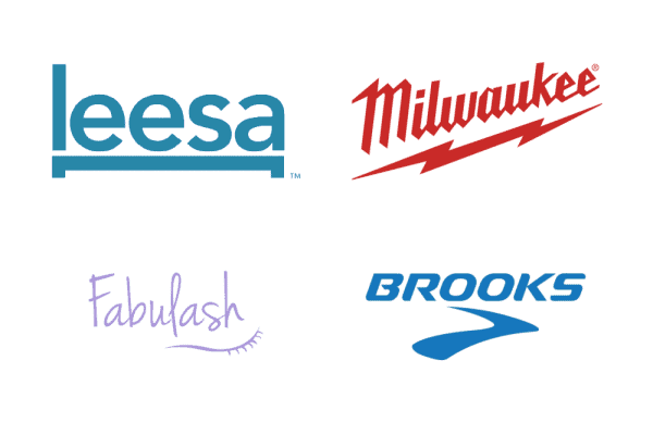
In logos that do use this arrangement, the symbol often acts as an underline, with a long, horizontal shape — these logos are prime examples of this.
Proceed with caution if…
Your symbol isn’t horizontal or underline-like. There are exceptions to this, but unless your symbol looks “natural” underneath your wordmark, this can be a tricky layout to pull off.
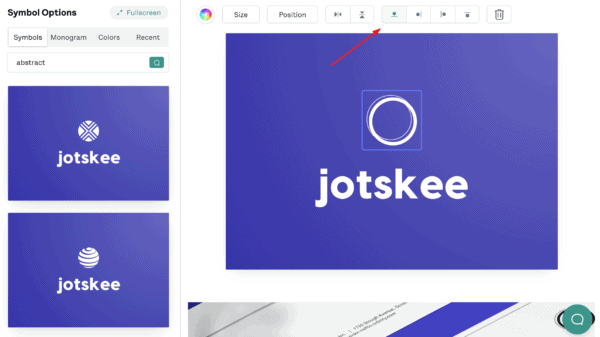
Tip: It’s easy to change your symbol’s position in the My Free Logo Maker editor! Go to the Symbol section and find the icon buttons to change where your symbol appears in relation to your company name: on top, to the left, to the right, or below.
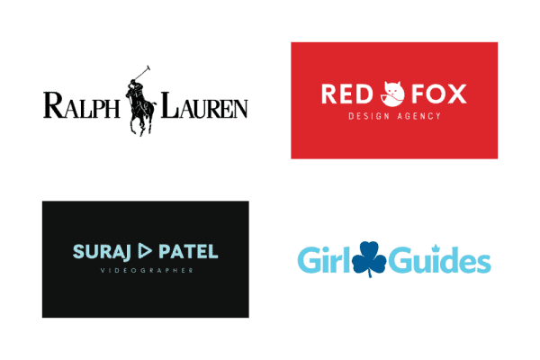
5. Logo symbol between words
If your company name has two words (or one word that can be broken into two), a symbol can act as a nice divider. It often takes some tweaking to get this layout right, but it’s worth a shot if you’re looking for something creative and unique.
For this arrangement to work, the symbol has to be relatively simple and compact (not too tall or wide) — though there are, of course, exceptions (see Ralph Lauren). In this layout, the spacing is usually tighter between the symbol and the text to keep the logo compact.
Proceed with caution if…
The two words in your company name aren’t similar in length. This arrangement looks best if the symbol is in the middle of your text, so if your company name is something like “Kid Wonderful,” or “Sandblastica Inc,” the symbol won’t land in the center of your design.
p.s. If you have another layout in mind — a symbol replacing a letter — see the next layout idea for details.
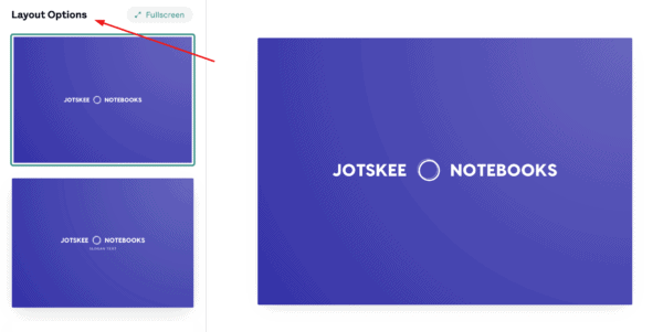
Tip: If your logo has two words, you can see layout options where your symbol is placed between the two words in My Free Logo Maker. To find this layout option, go to the Layout section in the left menu and scroll down until you see this variation. Select the design to save or edit it.
Note: You can’t manually insert a symbol between two words in your logo.
6. Logo symbol to replace a letter/letters
Here’s a layout that can be really cool when it works: a symbol that replaces a letter (or letters) in your company name. This design trick can work really well, but it can also take trial and patience to get it right.
If you’re opting for a symbol-as-letter layout, a simple symbol that matches the relative weight of your font is best; otherwise, you risk confusing people or having them not be able to read your company name correctly. (Hint: O’s and I’s are usually the easiest letters to turn into a symbol!).
Proceed with caution if…
Your company name doesn’t have any easy-to-replace letters, or you can’t think of a symbol that’s representative of your business that fits the design. In other words, don’t force it — if you can’t get it right, move on!
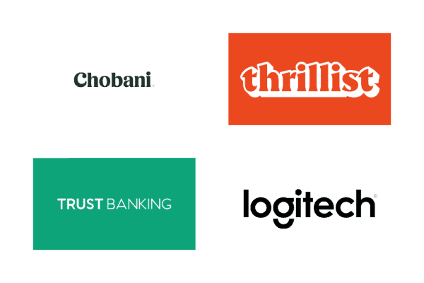
7. Single straight line
The simplest option for a text-only logo is a straight horizontal line of text. There’s a reason this style of logo is so popular, especially for brands with apps or physical products: it’s super easy to adapt! And it scales well, meaning it looks great on all sorts of applications.
The risk, of course, is that your logo will look boring if it’s too simple. That’s why you’ll want to choose a bold font you love, a hit of color, or a unique character (like the g in Logitech).
Proceed with caution if…
Your company name is long. As seen in the Trust Banking example, this can (and does!) work. But the longer your name is, the more horizontal stretch your logo will have — and that can make it hard to fit into smaller spaces like social media profiles.
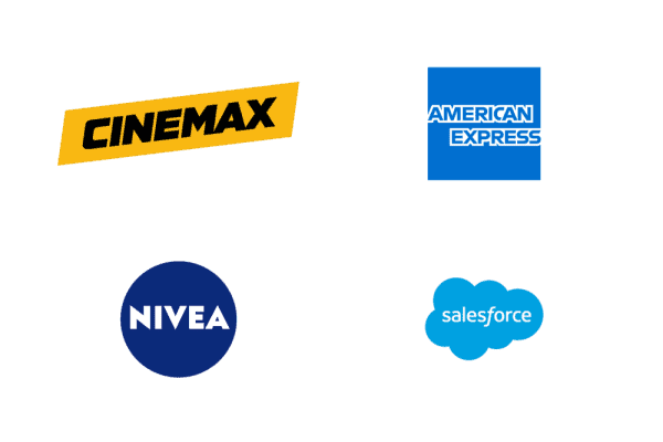
8. Wordmark in a solid shape
Another way to design an all-text logo is to put it in a solid shape or container. Adding this design element spruces up a wordmark and works well for shorter company names or initials. It can also act as a “stamp” on products like a clothing tag or label.
Be careful of the shape you choose — circles are great for shorter company names, while squares and rectangles are better for stacked text. Custom shapes (like the cloud in Salesforce) usually require a designer’s touch.
Proceed with caution if…
Your company name is long or you have a slogan. If this is the case, you may have to stack the text to fit it into a shape, or put your slogan below the shape — and that doesn’t always look good in this type of logo design.
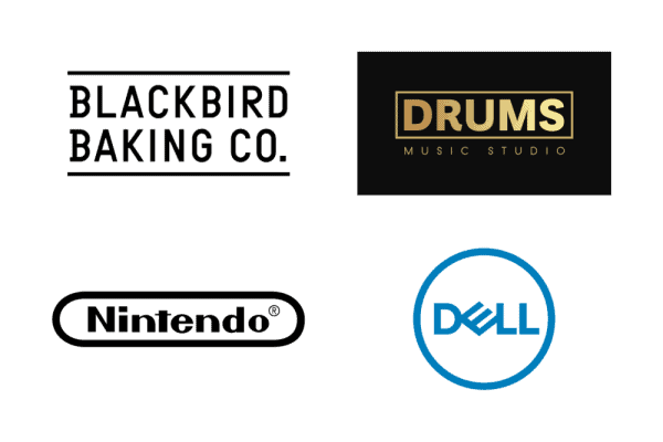
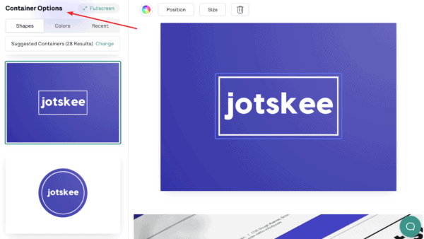
9. Wordmark in an outline shape/container
If a solid shape isn’t your thing, you can also put your wordmark in an outline shape or container (or put your text between two lines, as seen in the Blackbird Bakery example below). This layout lets your background color show through (if you have one).
The same rules apply for this logo layout as with a filled container — short name are better, and a slogan *can* work, but it might make it harder to get a clean design.
Tip: Want to put your logo in a shape? To try out this layout in My Free Logo Maker, go to Container in the left menu of the logo editor to see different shape options. You can also change container types (filled or outline) and colors from here.
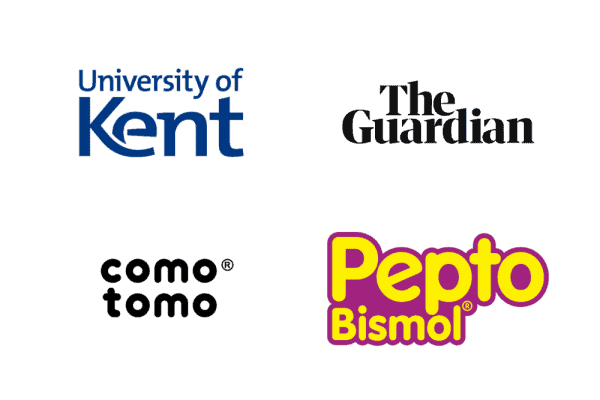
10. Simple stacked text
Stacked text is popular in combination logos, as seen in some examples above (e.g. The North Face). But this layout also works well for wordmark logos, as it can add visual interest and rein in long company names to fit a smaller space.
Stacking text takes a careful eye, as you’ll want the top and bottom rows of text to be evenly aligned and relatively similar in length.
Proceed with caution if…
Your company name is short! Breaking up one word onto two lines is possible, but it can make it harder for people to read or understand your company name at first glance. If you have a logo where the first and second words are vastly different lengths, be prepared for tweaking and resizing text to get things right.
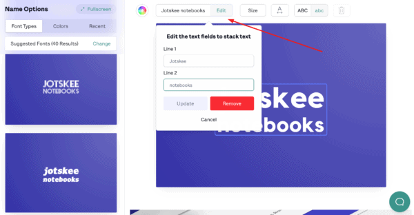
Tip: To try out a stacked-text layout in My Free Logo Maker, click the company name on the logo you’re working on. In the menu above your logo, your company name will appear in a text box. Click Stack beside the text box, then type the text you want on the second line and click Update.
And there you have it — 10 logo layouts to consider for your design. Take the length of your company name into account when trying out different layout ideas, and if you’re using a symbol, try putting it in different spots to see what looks best.
When you have a design or two you like, test it at different sizes (zoom in and out!) to ensure that it’s adaptable.
Jump into My Free Logo Maker to start playing around with layouts, or get more logo ideas by checking out our color pages.